 The terms 'popular' and 'art' have been used together on many occasions, but seldom with as much justification as with the books designed by Talwin Morris, Charles Rennie Mackintosh and others for Blackie & Son at the end of the 1800s and during the early years of the 1900s.
The combination of large scale publishing alongside the most progressive of contemporary design was used in such a way that not only were the volumes successful as a commercial venture, but they have since become highly regarded for their decorative qualities.
The work of the Glasgow School of Design is well known today, indeed the work of Charles Rennie Mackintosh has become part of the vernacular and the style is readily used and abused when artistic pretensions are being expressed. The houses, furnishings, objects and works of art that were designed by “The Four” and their circle are to be found in the world's finest museums and in the collections of the most moneyed collectors. The books discussed here are one aspect of the group's work that can still be obtained not only cheaply but also readily. So readily that there must have been a very large quantity of books produced, making this one of the Movement's greatest successes, indeed it has been estimated that production of books with decorative covers ran into the millions.
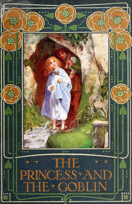 Blackie and Sons can trace their roots back to the beginning of the 1800s in Glasgow when, in 1809, John Blackie, Archibald Fullarton and William Somerville entered into partnership. At this date bookshops were still rare and it was through what we now call `part-works`that those who could read were able to purchase books. It was in this area of production that Blackie began; initially it would seem, specialising in technical books and non-fiction titles. Religious works were to be particularly successful and they published a number of decorative and impressive family Bibles that were available in instalments.
The Education Act of the early 1870s were to bring about the biggest changes and present the best ever opportunities for publishers like Blackie and their competitors. These Acts introduced compulsory education and consequently created a demand for books not only for schools but also through an ever increasing growth in levels of literacy. Blackie grasped the opportunities and by the end of the decade they had established themselves as major providers of educational texts and had started to produce a range of the popular classics for the schools market.
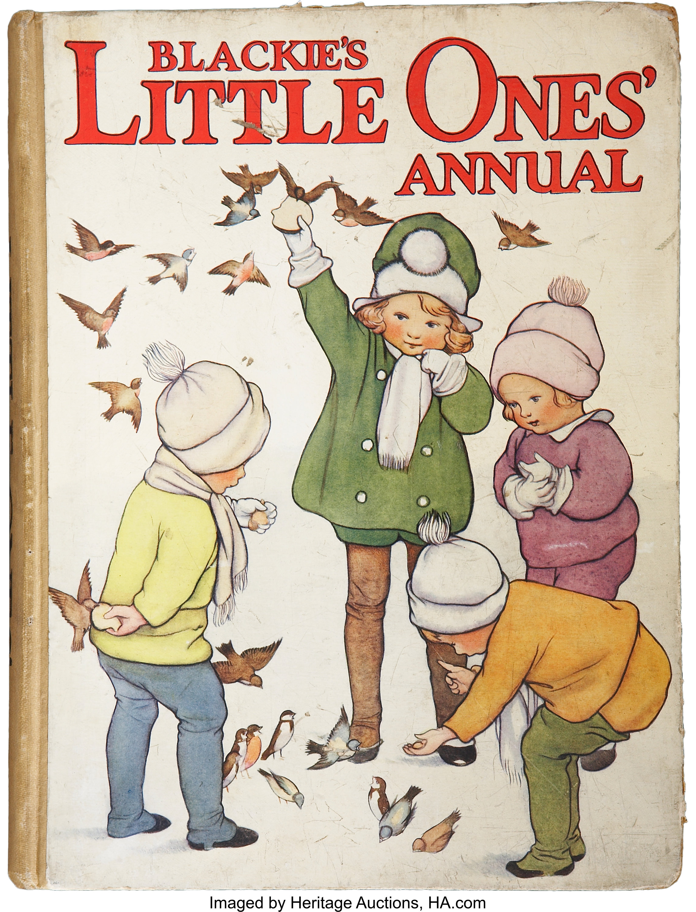
Blackies success was such that few children, born at the end of the 1800s and during the 1900s , could have avoided their books during their education. The works that are being considered in this article come within a sector of the educational publishing trade known as `reward books´. Victorian schools and Sunday schools were fond of giving prizes, and all children would receive a volume rewarding regular attendance. The classics were a regular choice for such books, and the use of decorative boards made these volumes all the more suitable for such prizes . Many of the books featured in this article have book plates or inscriptions recording the date or purpose of their award which gives them a geographical origin and exact date which help to add to their interest for collectors.
 Talwin Morris joined Blackie in Glasgow as head of the art department in 1893, and it was to be his influence and enthusiasm for the work of the local artists that was to bring about the various design collaborations as well as the developments in his own work that were to be so successful. Morris born in 1865, had begun his working life articled to an architect uncle, Joseph Morris, in Reading. This placed him very close to , if not at, the centre of the most progressive circles of the period with the Arts and Crafts Movement beginning its life in the minds of similarly aged group of young architects in London and Oxford. Morris like many of these contemporaries, developed an interest in the fine and decorative arts as well as architecture. The graphic art and publishing were to provide the necessary opportunities for the young designer , and it was amongst the avant-garde in Glasgow that he found a fruitful home for his talents. Not only did Morris find himself working amongst like minded young artists and designers, but also working for an employer who was prepared to embrace what some might have seen as a radical approach to design.
Talwin Morris became a central part of the Glasgow School of Design, and in keeping with the spirit of the Movement he designed his own furniture, interiors and other items such as jewellery, silver, picture frames and textiles. His work was featured in the leading journals of the period including The Studio and Dekorative Kunst, in which he was considered an equal to his friends Mackintosh, MacNair and the MacDonald sisters. `The Four´ who dominated the arts in the city at the time and whose works Morris had enthusiastically collected from the earliest days of the Movement.
 These are two acts which Morris should be remembered alongside his own work. First, the introduction of Mackintosh to Walter Blackie which resulted in Hill House which is surely Mackintosh's finest domestic work, and secondly, for introducing the work of the Glasgow group to Gleeson White, the editor of The Studio, the most influential publication concerned with the fine and decorative arts of the period. The shared interests of the Glasgow group and their combined enthusiasms helped to disseminate their work, and their close personal friendships and the proximity of production was to help develop a unity of style. This unity, an identity that is seen in Blackie's books that did their part to further spread the style throughout the country.
The `Glasgowness´of the designs is readily apparent, not least in the often-encountered series of linear designs used against a blue cloth background. One of the most regularly found is the design illustrated here on The Claxtons. Combining an apparent simplicity of line the design is dominated by the `whiplash´ line that was so favoured during the period, and coloured leaf or peacock tail type motifs which balance it and add colour. It was illustrated in The Studio in 1898 and Morris´designs were considered and highly praised, as were the publishers for applying the designs to school books and the popular classics rather than restricting them to the editions for limited circulation.
A more severely linear design can be seen on On Heroes and Hero Worship which uses a strong orange in conjunction with the lines to give the design vitality. The apparent simplicity of design is still able to combine the curvilinear that we associate with the period along the bottom line in the suggestion of trees or plant growth. Designs like these were used for a wide range of volumes and as much effort was taken with the spine as the front cover, giving all these volumes a terrific visual strength when shelved.
 A more florid and colourful cover design can be seen on Her Friend and Mine which carries Morris´monogram to the bottom right hand corner of the cover. The work is typical in the use of limited range of colours, necessary for economy of printing as much as for the stylish effect that it creates, and the framing of the title so that the design could be used for any work. The choice of motifs and style have no particular relationship to the volume. The strong framing of the design with a broad weighted base and strong horizontals are again typical features.
Morris did not work exclusively for titles published under the Blackie label; he also produced work for The Gresham Publishing Company a subsidiary of Blackie and Son. Some of the most striking and least `busy´designs that Morris produced were used on Gresham's books, such as The Modern Carpenter and Joiner and Cabinet Maker published in eight volumes from 1905. These large scale volumes use vivid colours in a limited way to give the volumes a visual strength, a busy design would have looked out of scale over such a large space. Morris skilfully covers the area giving it a solidity and strength befitting the subject matter. This design shows the elongated TM that Morris used as a monogram on some of his work, a more subtle signature can sometimes be seen in the form of three circle in a line which, when spaced in a particular way, are the morse code sign for TM.
The cover for Modern Electric Practice, another of Gresham's more expensively produced works, is a nice and rather less common example of Morris incorporating an element of the book's subject matter into the design. The hanging lights and candle lights are an integral part of the design, but the favoured practice of framing the title survives, albeit in an electrical coil. It is unmistakably the style of work produced by Talwin Morris, although not carrying his monogram this time.
 As head of the art department, Morris had control of the artistic output at Blackie and Son, consequently he not only used his own designs but commissioned work by other artists. It is likely this is how Mackintosh first came to produce designs for books for the firm. The attribution of designs for the covers is not without confusion and a number of different designs have been attributed to Mackintosh in recent years. It is certain that the design used for the book Terrie's Travels by Jennie Chappell is by Mackintosh as a drawing for the design is in the Hunterian Art Gallery collection. It is believed to be a design commissioned by Walter Blackie in c.1922 for a George Henty series of children's books which were apparently unused and later used for a series The Boys and Girls Bookshelf published in 1926. The instruction for the commission that the design should be manly and full of courage no too much “expressed in fancy” is apparent in its geometric nature.
Another design almost certainly by Mackintosh is for Tom Brown's Schooldays. These two designs used repeated geometric motifs, which differ markedly from the sinuous and naturalistically inspired work of Talwin Morris. They have a structural feel with the repeated blocks giving a structural solidity to the design, which supports rather than competes with the title.
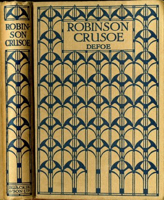
 The design used has been linked, not unreasonably, with a tapestry design by Otto Prutscher from the same period, and some have gone as far as to use this as sufficient evidence to attribute this design to Prutscher. Unfortunately there does not seem to be any evidence to suggest that Putscher, who was a prominent member of the Weiner Werstatte, worked for Blackie and Son. What is more likely is that Mackintosh was aware of Putscher's work and that there was a healthy exchange of ideas between artists who admired each other's work and were designing in a similar vein. There is clearly an Austrian feel to the design , this is evident in the curvature of the stylish arrowheads and in the linear structure provided by the clear verticals. It is very tempting to see this as Putscher's design but given the limited evidence available there seems to be a much greater likelihood that it is the work of Mackintosh.
One of the most colourful designs that Blackie used, and one which must have been quite popular at the time given the frequency with which it is encountered, is one seen here on Swiss Family Robinson. It is usually attributed to Ethel Lancombe, and it successfully blends strong colours with the linear and floral elements of the Glasgow style. The flower heads are archetypical `Glasgow roses´that might be encountered in the fine and decorative arts of any of the more famous `Four´. Lancombe is best remembered today for her prints that incorporate florid Art Nouveau motifs with pixies or princesses, often in gardens full of similar `Glasgow roses´. This is a very pleasing design that appeared in a number of different colour combinations including green and white against blue or brown and a lively orange and white against a red cover.
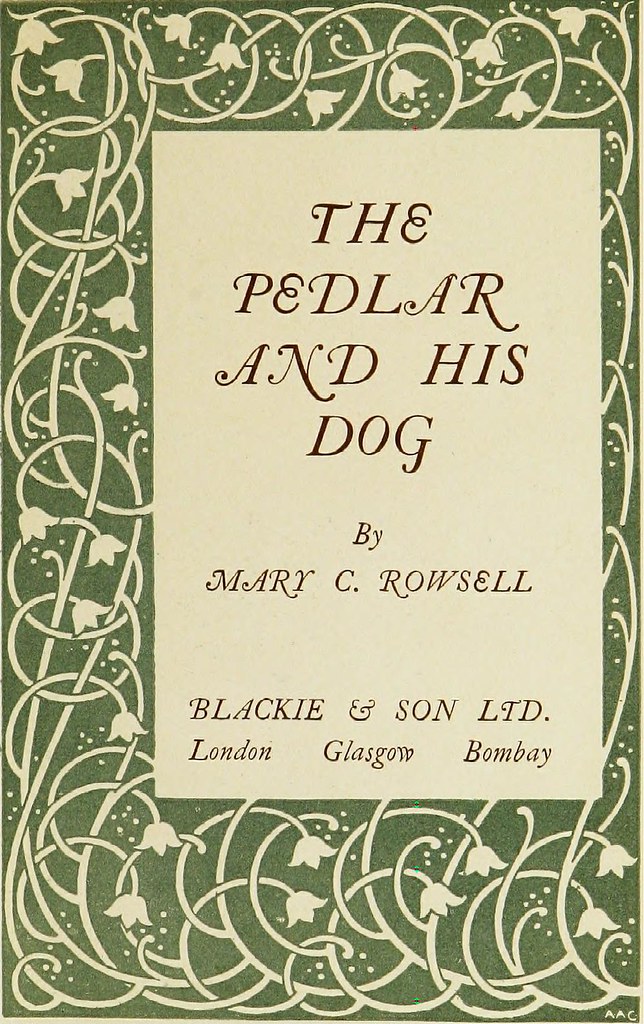 The Silver Studio is a name that is seldom linked with Blackie and Son, however the design of the cover illustrated here on In The Days of Prince Hal is one of a number that can be firmly attributed to the design studio, and almost certainly to the hand of Harry Knapper. The Silver Studio is best remembered for its founder, Arthur Silver's links with Liberty & Co and for the range of Art Nouveau inspired fabrics that the studio produced from 1880 onwards. It is possible that the link between Blackie and The Silver Studio is less frequently encountered as the publishers will have had no interest in promoting the work of a commercial studio. The forced anonymity of the designers is also one of the reasons that the names of Arthur and Rex Silver, and Harry Knapper, are not better known today.
The design illustrated is most probably by Harry Knapper who joined The Silver Studio in about 1893 and stayed there until 1898, being manager between Arthur Silver's death and his sons taking over the studio in 1900. There are at least seventeen designs for book covers for Blackie in The Silver Studio archive, including a design for this cover. The artist responsible is not recorded but it is thought, on stylish grounds, to be the work of Knapper. The influence of the architect and designer Charles Voysey, in particular in the form that the animals take, is also evident . The Silver Studio archives may hold more links between the two businesses, however none of the other designs illustrated in the 1980 catalogue of the collection have yet been discovered and it is possible that they were not used by Blackie.
Talwin Morris died suddenly in 1911 at the age of 45 when his work was still developing and the Glasgow Movement was at the height of its popularity. It is fitting that his friend Mackintosh designed his headstone. This date can also be seen as the beginning of the end of the best period for Glasgow with Mackintosh starting to take less interest in architectural commissions and looking towards his paintings as an end in itself. By the start of the First World War in 1914, the heyday of the Movement was clearly in the past.
Collecting Blackie books is a rewarding and affordable avenue for the lover of Mackintosh and his associates. And today, the market for these items is more accessible than it has been for many years with the majority of books that are sold are changing hands on eBay.The days when books could be purchased in charity shops or second hand bookshops for a couple of pounds seems to have gone, as indeed have so many second hand bookshops. Groups of books do occasionally appear in the regular London and provincial auctions that specialise in the post 1880 decorative arts, and in these sales the collections are often mixed and have probably been put together by dealers or collectors who have scoured the available sources for such volumes.
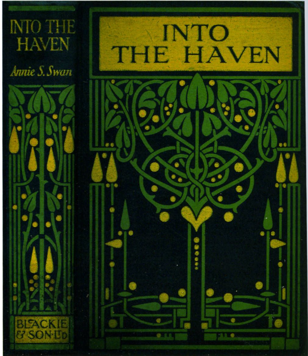 The most important factor for collectors seems to be, not surprisingly, condition. As these were often popular volumes and given that they are relatively fragile items that are now in the region of 100 years old, some very tatty books can be found, and these books should be avoided. Many books do survive in good condition and it is probably the fact that they were `reward books´that has led to their being kept for more than one generation when similar volumes have been discarded. It is also possible that the decorative appeal of the splines and covers has added to the number that have avoided the jumble sale pile over the years. Whatever the reasons the best condition will always attract the best prices and volumes in mint condition, when they can be found, should be treasured.
Volumes with a small amount of decoration tend to sell least well at less than £5, but good colourful editions in nice condition bring close to £20, and first rate condition and a good Mackintosh cover can give a price of closer to £35. The Greshan sets can sell for more, at times over £100 per set. Small figures in the light of the international importance of the Glasgow School of Design and when compared to the hundreds of thousands of pounds that the best pieces of furniture can bring. Many feel that these are beautiful and sophisticated works that, probably due to snobbery about their `popular art´status, are less well regarded that they ought to be. The simple fact that they were produced for the mass market is no reason to overlook these volumes.
It is possible that the majority of the extant volumes have now left the hands of the families that originally owned them as they have been coming on to the market through the natural dispersal of estates for some time now. The diminishing quantities available might suggest that the majority of volumes may already be in the hands of collectors, this often leads to an increase in prices for the best examples and a stabilising of the market for the volumes that collectors do not want due to greater availability, condition and less desirable designs. Time will tell, but even in these difficult to predict times these volumes cannot be seen as anything other than absolute bargains and amongst the best value to be had in the market for Glasgow School of decorative arts.
